
Norse
where myth meets malt
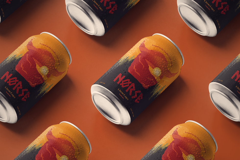
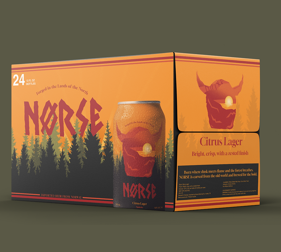
A beer born in the North, where to be lost in nature is to be found. Norse was crafted for the bold, the seekers, and the storytellers who raise a glass to something greater than themselves. Rugged silhouettes. Hidden lettering. Mist and shadow pulled straight from the old world. This is more than beer it’s myth poured into a can. Welcome to Norse forged in the land of the North.
Discovery
This moodboard is all about capturing the raw essence of Norse culture, where ancient craftsmanship meets untamed nature. The weathered metals bring out the grit and strength of Viking tradition. These elements tell a story of power and resilience. It is a world built on raw textures, spirit, and the timeless landscapes that shaped the Vikings, setting the stage for a brand that feels alive and unapologetically bold.

These sketches are the first rough ideas for the Norse brand, pulling inspiration from Viking helmets, warriors, and old symbols of strength. They’re quick and raw, but you can already see it starting to come together. It’s the early stage where ideas are messy but full of potential, setting the tone for something bold and powerful.
Sketches

Digital draft
I After sketching out some ideas, I had a clear vision for the logo. At first, I tried keeping it black and white, but it just didn’t work. I needed color to separate the layers and give it more depth. The design also felt like it was missing that Norwegian touch, something that would really bring the character to life. Without giving to much away. That’s when I leaned into a warm, orangey palette inspired by the incredible Norwegian sunsets. It tied in nicely with the bar and outdoor vibe I was going for. My idea was to create a kind of portal: a stone-carved silhouette that opens into another world, waiting to be explored.
Final Concept
For the final concept, I really focused on making this logo feel unique and authentically Norwegian. I used a gradient with texture so the beard looks and feels rough, and carried that into the top of the logo to create depth in the sunset. If you look closely, you’ll see hidden lettering arcing across the head, it spells out VIKING, inspired by ancient Norse forms and influenced by Hoenir, the silent god of perception. The typeface ties it all together, I wanted the typeface to connect with the logo and carry the feel of Old Norse symbolism. After a few tries and stepping back to look at what I had, I noticed the jagged edges in the silhouette and used that as inspiration to create a custom typeface. I’m proud of how it turned out and how it ties everything together.


Reflection
This logo design taught me a lot about pushing my ideas further and exploring new ways to create depth in my work. I learned how details like texture, light, and hidden elements can transform a simple logo into something layered and meaningful. More than just building a brand mark, the process showed me how design can tell a story and capture a mood, and it pushed me to experiment with techniques I had never used before. It’s a project that not only challenged me but also helped me grow as a designer.